A collaborative approach to designing a complex dental health process to mobile intuitive interfaces
See Prototype.png)

Toothlens is a startup company, that wanted to create a user interface that was crafted to allow easy tooth scanning and clear visualization of dental health assessment results. Efforts focused on maximizing usability and the quality of user experience.
I followed the design thinking framework to complete the project. I conducted interviews and created empathy maps to understand the users' needs.
.jpg)
Consumers struggle to consistently monitor dental health and perform adequate preventative care from home. Existing solutions fail to provide accessible, immediate, and personalized dental health insights. There is a consumer need that enables convenient dental scanning at home with customized assessments and insights.

I worked closely with my team over the course of 3 months. The project was kicked off with a stakeholder meeting to get a better understanding of the business goals and requirements. This diagram is a snapshot of the process I followed.


30 yrs old | San Diego, California | Digital Media Manager
Here’s what some of the users said when asked about how they monitor dental hygiene.
Every time I go to the dentist, I'm scared they'll find a new issue that needs treatment.
A tooth scanner would give me some relief between visits.
I barely have time to floss so I need something quick to check if my dental health is okay.
Wants alerts based on issues that are arising. Should be able to see trends that will prompt flossing improvements.
The purpose of the heuristic evaluation was to quickly and easily find usability problems related to vendor signup and product listing. I went through the signup and product listing process while assessing the site against Jakob Nielsen's 10 general principles for interaction design. Below are the key issues I discovered.
There is no clear indication of whether the scan is in progress completed, or if an error occurred. Users are unsure about the next steps after completing a scan.
It was unclear where the scan could start, and users didn’t realize they had to press a button to initiate the process.
If a scan is blurry or incorrect, there is no clear way to retake it without starting the entire process over.
No guidance is provided if users position the camera incorrectly.

Guides users through setting up profiles and explaining features. Introduced the user to the app’s purpose and key functionalities by breaking it down into three onboarding screens. They are then guided to set up their account.

The homepage displays a progress bar, indicating the severity level. The challenge faced while developing the feature is to guide users on how to scan their teeth. Once users scan all parts of their teeth, it analyzes and indicates the risk level in their teeth.
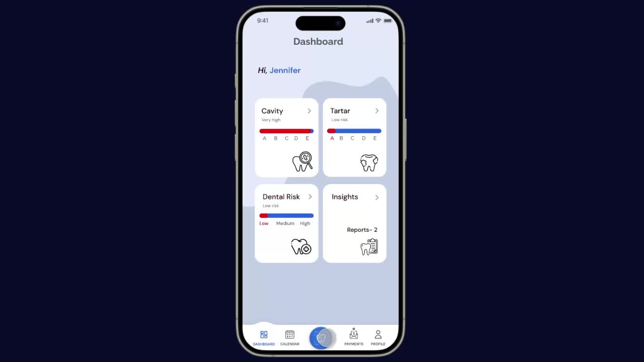
The navigation bar features links to the profile, payment, calendar, and scan features for quick access and ease of use. This flow depicts how users can schedule their appointments with doctors and check their upcoming meetings.

Ease of use and satisfaction were two key metrics that were measured during the research phase and the usability test. While the design solution had not yet been implemented on the live site at the this time, I was able to see that the redesign had a positive impact on users

The dental scanning feature led to a 45% increase in user engagement, as users found it easy and convenient to assess their dental health from home.

Conducting user testing and heuristic evaluations helped us refine the scanner’s interface, leading to a 10% improvement in usability and ease of navigation.

Users could instantly book consultations with recommended dentists, leading to higher conversion rates and improved patient-doctor connections.
This project has been a fantastic experience from beginning to end. It's also been fun, challenging, and educational.
