


Improving the aspects of health from physical to mental and beyond.
See Prototype
There's a lot of health and wellness info available today, yet many people still have difficulty understanding and addressing their well-being. The problem is that most current platforms focus only on physical or mental health, making it difficult to understand a person's total well-being.

.png)
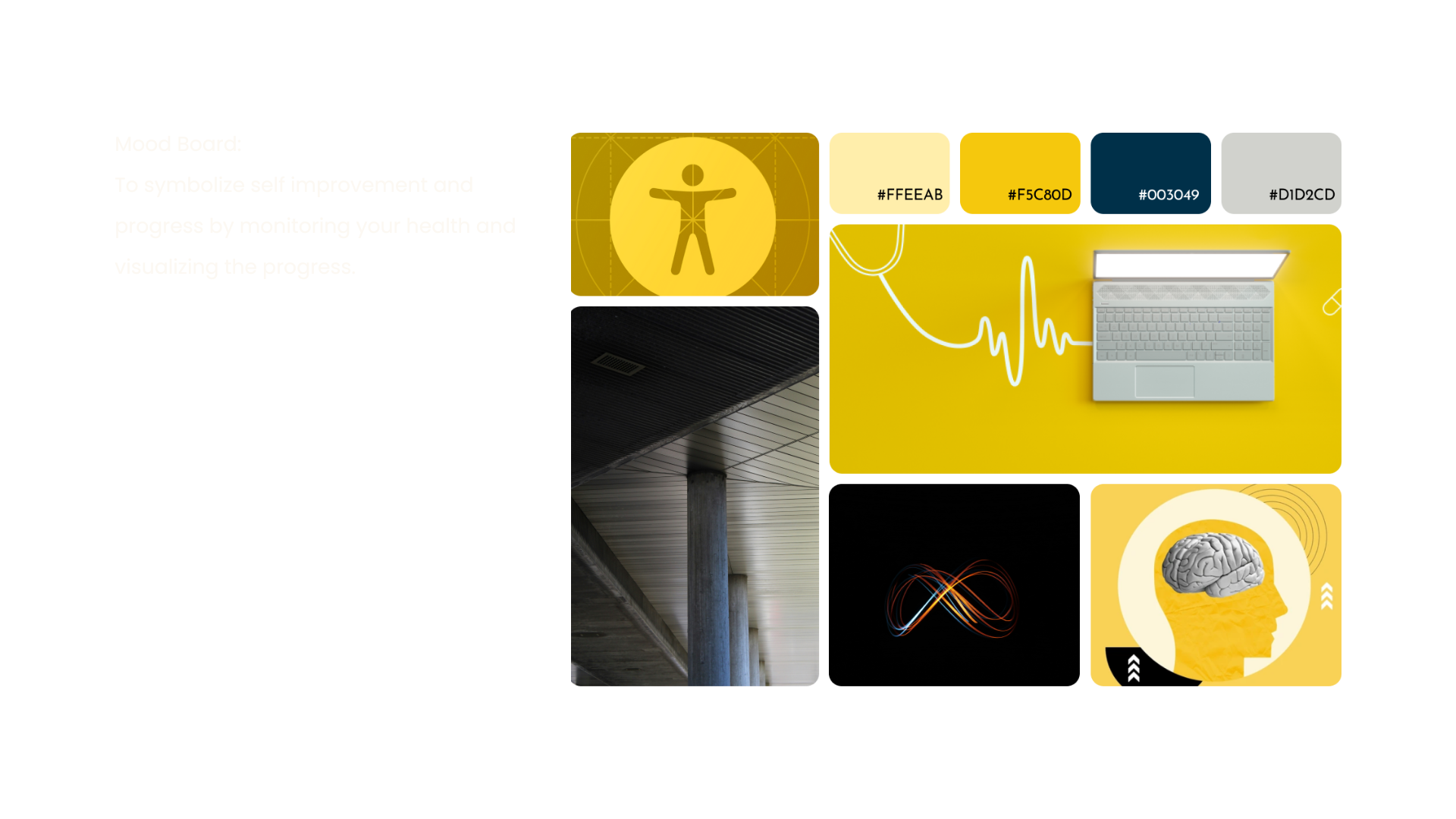
We started with brainstorming words that helped us implement a mood for our company. Creating a mood board helped us to visually represent the essence and identity of Divinity Science.
* Identified words of inspiration or attributes to define the brand.

The project team developed a brand direction, which is a narrative that inspires visual and verbal identity and weaves together brand elements to create an emotionally resonant concept. I like how the new brand identity uses vibrant, energetic colors that represent positivity, self-motivation, and accessibility.
It has a modern, sleek look that symbolizes sophistication and privacy. Also, the scenes of growth and natural landscapes depict a healthy environment and add a lot to the brand's aesthetic.
As you can see, the Business Model Canvas clearly shows how to align your design approach with the business objectives. It highlights some of the key factors, like key propositions, customer satisfaction, revenue streams, cost structure, and key partners.

We found gaps by distributing a survey to our target audience. We also conducted one-on-one interviews with our target audience. We used surveys and interviews to gather qualitative and quantitative data on their wellness habits, challenges, and preferences. We used an affinity map to organize the findings and identify themes, user needs, and pain points.
We conducted user interviews via Zoom and used SurveyMonkey to gather survey data, allowing us to collect insights efficiently from a diverse, online participant group.
No. of participants for Survey: 100
*Diverse in age, gender, location and health habits.

After completing surveys and interviews, I created an affinity map. It helped me to organize the information and make sense of it all. Next, I made user personas, user journeys, and user flows. These materials displayed the data in a way that followed the same logic and the same visual theme.
The key takeaway from our user research is that participants seek personalized wellness recommendations aligned with their health goals. They value a user-friendly interface, seamless integration into daily routines, and clear, accessible data. Key challenges include maintaining motivation and ensuring data privacy through transparent communication.

With our users in mind, we mapped out the user flow. This crucial step helped us visualize the user journey and identify potential pain points before we even started designing.
Personas keep the focus on real user needs, motivations, and pain points, ensuring that design decisions are aligned with what users genuinely seek in a wellness platform. This approach helps create a product that feels personalized and relevant to the users.
.png)
.png)

Firstly, we visualized the app's basic layout and structure on paper. And then;

I kept the colors simple and chose a modern, variable Lexend font that is easy to read on all screens. I kept layouts consistent by using a 4-column grid.


Developed a "seamless introduction” to give the user a clear understanding of the introductory sequence of the app. I decided to start with the first task in the onboarding screens because this is the first step a user would take upon opening the app.

After the first step, the user would be presented with a survey asking them wellness-related questions to create a personalized profile.

We tried to keep the homepage minimalistic, which displays curated content as per users’ survey results. It displays functionalities like wellness over time as well as achievements.

20%
improvement in brand recognition
25%
increase in post-design feedback, showed increase in positive user satisfaction scores.
Contributed to an increase in Kickstarter campaign engagement through improved visual design and marketing.
